On Nov 10 I was part of a celebration of John W. Tukey at the United Nations. This event kicked off a new UN initiative called Unite Ideas. Details of the event, and the initiative can be found here. There were five talks relayed live to an audience of several thousand, using google hangouts and a youtube channel, and listeners could post questions using the Q/A tool.
My talk was titled “An Exploratory Data Analysis of OECD’s 2012 PISA Survey”s and I delivered it by computer from my office in Iowa. The experience of talking to the computer without visual feedback of the audience felt awkward. My parents in Australia got up at 1am their time to tune in, and they reported “went ok”, and “we liked how you answered the questions”. I decided to talk on this topic because it showcased EDA tools for exploring data rather than talking about tools. I worked with Ian Lyttle, Alex Shum and Luke Fostveldt exploring the data over the summer as part of a competition for useR! 2014, and have previously talked about it on this in our working group. The education data is huge, and I was very surprised by what we found, and that is what EDA can do “the greatest value of a picture is when it forces us to notice what we never expected to see” (quote by Tukey). Often what I find in data are just problems, good to know about, but a little embarrassing to the data owner. Plots of this data blew up one of the myths that I was living with.
There were a few questions posted, and this is the main reason for this blog. It is to address this question:
“When you draw conclusions about response variables based on one-predictor-at-at-time analyses, you are of course quite likely to be a victim of confounding.”
I answered this live, perhaps not very well, but I have also been asked similar questions at various times over the years, and it is a good question, worth further attention. The question arises because I looked just at differences in math scores just for one covariate, separately by country - this is what the “one predictor at a time” means. By only looking at gender, and not at school, age, hours spent studying, parents’ socioeconomic status, truancy, number of possessions, number of math teachers, attitude to math, … there is a danger that the results change at a finer resolution. Yes, this is something that you should always be cautious about.
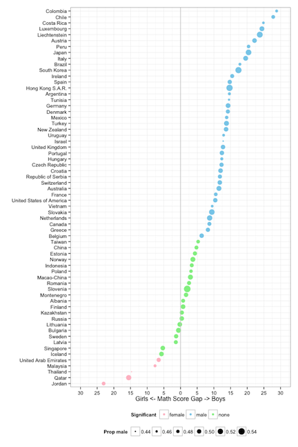
To counter this, a modeler would fit many, many variables and the interactions simultaneously and look at the coefficients for the predictors in the model, in order to make a statement about gender and math scores. However, this is at odds, to a large extent with EDA, where the fundamentals dictate light processing of the data. If you overly process the data you might miss key features like outliers, clusters, small pockets of heterogeneity. My first instincts with the gender bias is not universal observation was to be skeptical: could it really be that in Qatar girls score 15 points better than boys on average? This could be an artifact induced by small sample size, or unequal proportions of gender in the sample. Simpson’s paradox can occur when proportions and counts are different between categories that are aggregated - look up the famous Berkeley admissions data.
Neither of these are culprits for these five countries with the reverse gender gap. There were 7000 students, with 51% girls and 49% boys being measured in Jordan. In addition, students were drawn from about 250 different schools. These are quick and easy checks that can be done for data like this. Actually for many of the plots that we made of the data we also made bar charts of the category counts to guard against reading too much into the patterns of the math scores. You should be suspicious of results reported without these numbers.
Another check can be done, which is the lineup protocol discussed in an earlier blog. Put the plot of the data in amongst a field of plots of null data. We can create the null data sets for this data by permuting the gender labels of students, within each country, recalculate the difference in average math scores, and remake the dotplot. This is done below.
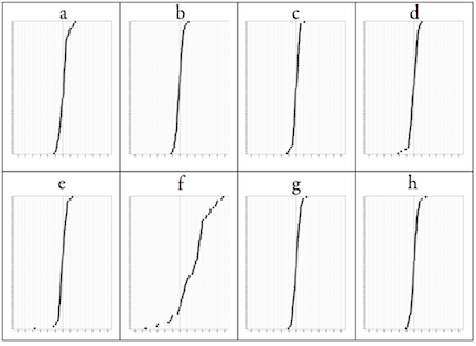
The plot of the data (f) stands out amongst the rest of the plots. The largest gap that is produced by random labels is on the order of 5 points, and we see a pretty even spread between boys and girls. The data stands out in this bunch because there are more countries that have a higher boys average score and because some countries have much bigger average differences than 5 points. The nearest that we get to something odd is on plot (e) where there is one country where there is a gender gap in favor of girls of about 18 points. However, this is due to the one country with small numbers, Lichtenstein, which only measured 300 students. It should have been removed from the analysis ahead of time.
Aside: there was another question/comment, “When you see it… of course it is there!”, that appeared when I showed this lineup. I didn’t have a chance to answer it. What you see in a plot is typically a sample, and so you need to gauge whether the pattern observed is going to occur if you take another sample, or disappear. This is what “really there” means, that the pattern is present in the population. Deviations will occur from sample to sample, and it is important to ignore these for the most part.
One last comment about using single predictors. We cannot say definitively that there is not a universal gender gap in math. This would require a designed experiment, a huge one. The PISA data is observational data. It suggests that there isn’t a universal gender gap, and this stands up to a couple of quick checks. If this pattern repeated itself in other testing years then this would be further evidence, but not proof. You can’t always prove things with observational data but with enough different elements the evidence builds up. The other piece of information that I have in favor of the reverse gender gap in the middle eastern countries is that my female colleagues in statistics education at Duke University were not at all surprised. They knew about this pattern. But for me, and most of my colleagues, making a few pictures of the data shattered a myth.
Video footage of the event is available here.